
Written by: The Editorial Team
Published: 14 Aug 2026
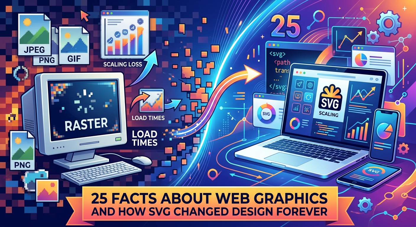
Web graphics have been through a wild journey. From the blinking banners of the early internet to the crisp, scalable icons you see on every modern website, the technology behind digital images has changed more than most people realize. And at the center of that transformation sits one file format that quietly reshaped the whole industry.
SVG did not just improve web graphics, it fundamentally changed what graphics on the web could do.
- Vector images scale to any size without losing sharpness, making them ideal for every screen from a smartwatch to a 4K monitor.
- SVG files are plain text, which means they can be indexed by search engines and animated with CSS or JavaScript.
- The shift from raster sprites to SVG icons cut load times, reduced maintenance overhead, and opened the door to interactive, themeable graphics.
Where It All Started: The GIF Era
Fact 1. The GIF format dates back to 1987, created by CompuServe as a way to compress images for transmission over slow dial-up connections. It was a practical solution for its time, not an artistic choice.
Fact 2. GIF supports only 256 colors. That limitation was never a design decision, it was a technical constraint of the LZW compression algorithm used to keep file sizes manageable.
Fact 3. The animated GIF, still wildly popular today for memes and reaction images, was introduced in GIF89a in 1989. It allowed multiple frames to be stored in a single file.
Fact 4. Despite being over three decades old, GIF remains widely used for short looping animations on social platforms because browser support is universal and no video codec is required.
The Rise of PNG
Fact 5. PNG, short for Portable Network Graphics, was developed in 1995 specifically to replace GIF. The goal was a patent-free format that could handle more colors and better transparency.
Fact 6. Unlike GIF, PNG supports up to 16 million colors. It also introduced alpha channel transparency, which means pixels can be partially transparent rather than just fully on or off.
Fact 7. PNG uses lossless compression. Every pixel is preserved exactly as stored. This makes it perfect for logos, screenshots, and icons where sharp edges matter.
Fact 8. PNG is not great for photographs, though. Because it stores every pixel, photo files can be enormous compared to JPEG, which uses lossy compression to discard detail the eye barely notices.
Fact 9. The "N" in PNG does not stand for "not GIF," though that joke circulated among developers for years. The format's recursive acronym stands for PNG's Not GIF, which was an in-joke that stuck.
What SVG Actually Is
Fact 10. SVG stands for Scalable Vector Graphics. It describes images using mathematical coordinates rather than pixels, which is why an SVG circle looks equally perfect at 10 pixels wide or 10,000.
Fact 11. SVG is an XML-based format. The file is plain text and human-readable. Open one in a text editor and you will see code, not binary data.
Fact 12. The Scalable Vector Graphics specification is maintained by the W3C, the same body that governs HTML and CSS standards. SVG has been a W3C standard since 2001.
Fact 13. Because SVG is XML, it can be embedded directly inside an HTML document. That means no separate HTTP request for the image file, which can meaningfully reduce page load time.
Fact 14. SVG files are often dramatically smaller than their PNG or JPEG equivalents. A simple icon that might weigh 8KB as a PNG can be under 1KB as an SVG, particularly after minification.
How Vector Graphics Work
Fact 15. Raster images store information as a grid of pixels. Vector images store shapes as mathematical instructions: draw a circle of radius 50 at coordinates (100, 100), fill it with blue.
Fact 16. When you zoom into a raster image past its native resolution, you see pixelation, the blocky artifact of the software guessing what color a new pixel should be. Vector images never pixelate because they recalculate the shapes at every size.
Fact 17. Resolution independence is what makes SVG so powerful for modern web design. A single file works equally well on a low-DPI laptop screen and a high-DPI Retina display without any extra work from the designer.
Fact 18. Vector formats are also native to print. Designers routinely export SVG files directly to professional printing software, because vector paths carry no resolution limit.
SVG and CSS Animation
Fact 19. Because SVG lives in the DOM just like HTML elements, you can target SVG shapes with CSS selectors and animate them with CSS transitions and keyframes. This was not possible with raster images.
Fact 20. Before SVG became practical, developers used CSS sprites: a single large image file containing every icon on the site, displayed by shifting the background position with CSS. It worked, but maintaining the sprite sheet was tedious and error-prone.
Fact 21. SVG icon systems replaced sprites and solved several problems at once. Individual icons can be styled differently on the same page, colored dynamically with CSS variables, and animated on hover without JavaScript.
Fact 22. SMIL, the Synchronized Multimedia Integration Language, allowed animation directly inside SVG files long before CSS animation matured. Some browsers dropped SMIL support, pushing the industry toward CSS and JavaScript animation instead.
Real-World SVG Applications
One of the most widespread uses of SVG today is in platform and brand identity graphics. Logos, wordmarks, and app icons rendered as vectors stay sharp on every device, which is exactly why the web's biggest platforms publish vector versions of their assets.
The clearest everyday example of this is social media icons embedded across the web. Every time you see a Facebook, Instagram, or X icon rendered crisp on both a budget Android phone and a 5K iMac display, you are looking at SVG doing exactly what it was designed to do.
Here are the key advantages SVG brings to icon design specifically:
- No separate image files needed for different screen densities
- Color can be changed at runtime with a single CSS variable
- Icons can respond to hover and focus states without JavaScript
- File sizes are small enough to inline directly in HTML
- Screen readers can access the title element inside the SVG for accessibility
25 Facts: The Full Picture
Here is the complete numbered list of all 25 facts, condensed for easy reference:
- GIF was invented in 1987 by CompuServe.
- GIF supports only 256 colors.
- Animated GIF arrived in 1989 with the GIF89a spec.
- GIF remains popular for short looping clips despite its age.
- PNG was created in 1995 as a patent-free GIF replacement.
- PNG supports 16 million colors and alpha transparency.
- PNG uses lossless compression, storing every pixel exactly.
- PNG produces large files for photographs compared to JPEG.
- PNG's recursive name was originally a developer in-joke.
- SVG describes images with coordinates, not pixels.
- SVG files are plain text written in XML.
- SVG has been a W3C standard since 2001.
- SVG can be embedded directly inside HTML without a separate request.
- Simple SVG icons can be under 1KB after minification.
- Raster images store pixel grids; vectors store mathematical shapes.
- Raster images pixelate when zoomed past native resolution; vectors never do.
- One SVG file works on every screen density without modification.
- SVG is also native to professional print workflows.
- CSS can target and animate SVG shapes directly in the DOM.
- CSS sprites were the pre-SVG solution for icon management.
- SVG icon systems allow per-instance styling on the same page.
- SMIL provided early SVG animation before CSS animation matured.
- Social media platform logos are among the most common SVG assets online.
- SVG title elements make graphics accessible to screen readers.
- Inlining SVG removes one HTTP request per icon, improving page performance.
The Broader Context of Image Format History
The web's image format history mirrors the web's own growth. In the early 1990s, bandwidth was so precious that 256 colors was a reasonable tradeoff. By the mid-1990s, PNG offered something better for a web that was starting to carry real graphic design.
But even PNG was still a pixel-based solution. Every image had a fixed resolution baked in. As smartphones arrived and screens multiplied in size and density, the pixel-grid model started to crack. Designers were producing separate assets at 1x, 2x, and 3x resolutions just to keep logos looking sharp across devices.
SVG cut through all of that. Because the format stores instructions rather than pixels, the display hardware itself handles the rendering at whatever size and density it needs. The designer creates one file. The browser does the rest.
The history of web graphics formats traces a consistent line: every major format shift happened because the previous solution stopped scaling with the web's ambitions.
Why SVG Keeps Winning
SVG adoption has only accelerated since the mid-2010s, when browser support finally became universal. A few factors have kept it dominant.
File size is the most obvious. An SVG icon system for an entire application can weigh less than a single medium-resolution JPEG. For mobile users on slower connections, that matters.
Accessibility is the second factor. Raster images require alt text applied externally. SVG can carry its own semantic meaning inside the file, making it easier to build accessible interfaces from the start.
And theming is the third. In an era of dark mode, brand color variants, and user-configurable interfaces, being able to change an icon's color with one CSS variable rather than swapping an entire image file is a genuine architectural advantage.
The 25 Facts That Changed How We See the Web
Web graphics were never just about making things look nice. Every format shift from GIF to PNG to SVG solved a real problem that the previous format created. The move to vector was not a style choice. It was a logical response to a world full of screens in every shape, size, and density imaginable.
SVG gave designers something raster formats never could: a single source of truth that the display hardware interprets perfectly, every time. Twenty-five facts in, and that single principle explains most of what has happened to web graphics over the last three decades.
Was this page helpful?
Our commitment to delivering trustworthy and engaging content is at the heart of what we do. Each fact on our site is contributed by real users like you, bringing a wealth of diverse insights and information. To ensure the highest standards of accuracy and reliability, our dedicated editors meticulously review each submission. This process guarantees that the facts we share are not only fascinating but also credible. Trust in our commitment to quality and authenticity as you explore and learn with us.